Cedar: Outstanding Balances
May 2021—Jan 2022
Cedar is a patient payment and engagement platform focused on billing and digital check-in. While working on Cedar's Pre-Visit product, I led the research and design of a new feature to help healthcare providers collect outstanding balances during digital check-in, while maintaining an empathetic patient experience.
Role: Lead Product Designer and User Researcher
Team: 1 PM, 3 Engineers, 1 UX Researcher (consulting)
Results
- Successfully advocated to hospital systems for flexible, light-touch approach based on UXR, including emphasising payment plans for larger balances
- Increased payment collection rate by 4.1% over baseline (for context: this is a huge increase in Revenue Cycle Management)
- Mitigated risks of showing balances during digital check-in: kept Pre-Visit's patient satisfaction score of 92%, no increase in visit cancellation rate
- Maintained patient dignity and reduced embarrassment around medical debt
- Increased front desk staff satisfaction by taking over outstanding balance reminders

Context
Cedar's Pre-Visit product makes medical check-in easier by letting patients handle paperwork and copays before they arrive at their appointment. This means less time in the waiting room and lets front desk staff focus on helping patients instead of dealing with paperwork.
This project started when our healthcare partners asked us to add a feature that would remind patients about unpaid bills (outstanding balances) during digital check-in. While it made sense from a business perspective, we had actually considered this feature earlier and deliberately left it out of our MVP - we knew it would be necessary at some point but needed to be done thoughtfully and were sprinting to get our product to market. Reminding patients about unpaid bills risked causing them to defer or cancel care they needed.
However, our experience working with providers on our MVP showed they were willing and even keen to take our product advice if it was backed by user research and sensitive to their business needs, so I led the project to answer the question: how could we help providers collect these payments while still taking care of patients' needs?
Research
I'll just cover the highlights here, but we had some great and surprising insights that led us to great solution! I wrote more about the research project in this blogpost for Cedar
Methodology
- Conducted over 40 user research sessions, mix of facilitated and unsupervised
- Interviewed representative sample of patients: income levels, regions, insurance status and coverage level, gender, age, frequency of medical care
- Tested multiple prototypes with varying balance amounts
- Explored patient preferences around payment timing and communication methods
Key Findings
1. Digital vs. Human Communication
- Patients strongly preferred receiving payment reminders from a digital system rather than in person
- Face-to-face payment requests felt embarrassing, especially in public waiting rooms
- Digital reminders were perceived as more neutral and less judgmental
2. Timing Preferences
- Patients overwhelmingly preferred earlier notifications about outstanding balances
- Earlier awareness helped with financial planning and budgeting
- Advanced notice reduced stress about unexpected medical expenses
3. Balance-Specific Approaches
- Small balances: Patients appreciated convenient "clear it now" options
- Large balances: Patients valued seeing flexible payment plan options upfront
- Proactive offering of payment plans made providers seem more understanding
Solution Implications
- Keep it low pressure: Show balances in a way that's easy skip, making it clear that paying it isn't required for check-in
- Early notification: Present bills before they're due to help with financial planning, while clearly showing actual due dates
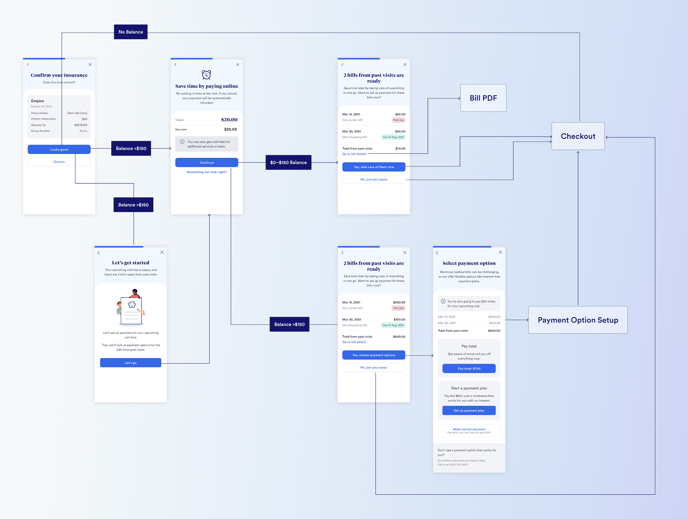
- Smart balance handling: For larger bills (over $150), proactively show payment plan options, while smaller amounts focus on convenience with messages like "take care of it now"
- Complement the office experience: Train front desk staff not to bring up balances - a win-win because they and patients both found them uncomfortable.
Note: I worked with our Data Science team to choose the $150 threshold because it's where the payment rate begins to drop-off, and it was close to the amount patients cited in user research as requiring more planning and thought.
Design

Taking account of the UXR findings, I landed on this design after exploring options and running evaluative user research. Some of the key ways in which the research was applied:
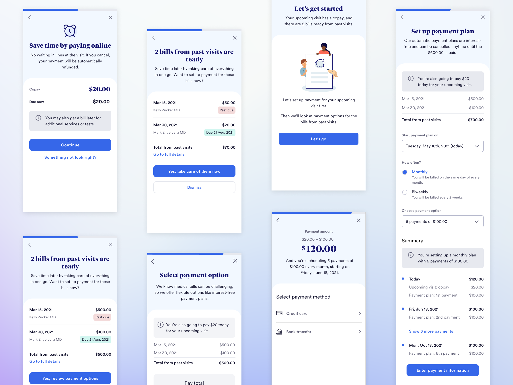
- For balances <$150, the actions are to pay in full or skip; for >$150, the CTA text calls out "payment options" and then clearly shows them
- There's a clear escape hatch for the user to skip paying the balance
- We added the link to the full bill details in response to user feedback that they'd only pay if they knew what the bills were, and if it was more than a few days ago, they often wouldn't remember
- For larger balances, I added a "primer" screen calling out there are payment options before showing the bills, to avoid scaring the user
Despite the relatively simple flow, there was actually quite a lot to account for in the design, e.g.:
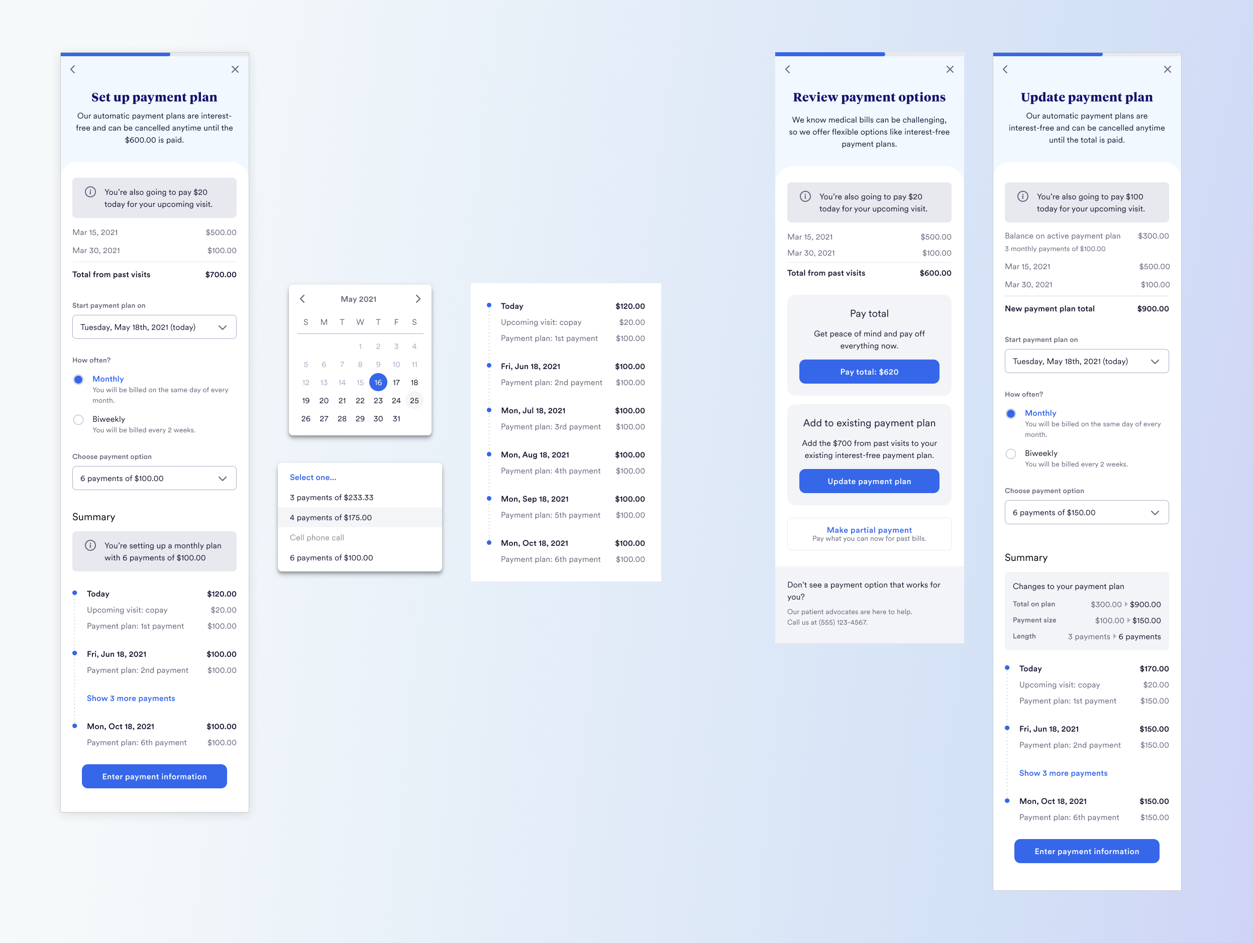
- Payment Plans: this in particular required work to come up with a design to present the options for setting up a plan independently, and also making it clear when everything would be charged—the timeline UI I came up with ended up being applied to our post-visit billing product.
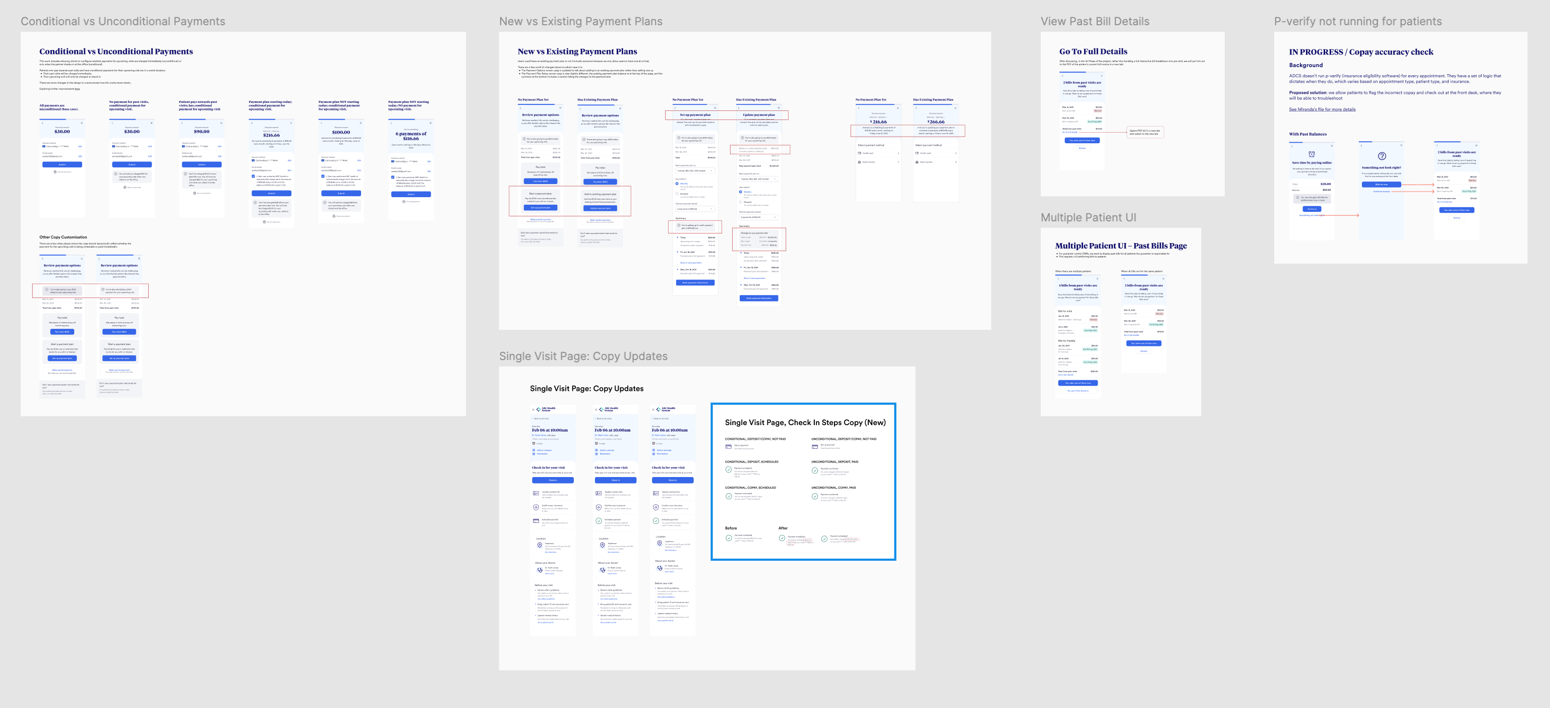
- Many variations and edge cases, e.g. $0 copays, patients who were guarantors for other patients' bills, conditional payments (where the copay is scheduled rather than charged immediately)

