Speakeasy
October 2023—June 2024
NOTE: This doesn't follow the standard product design case study format because it’s about an app that I conceived of and shipped myself (including coding it) with 1 co-founder.
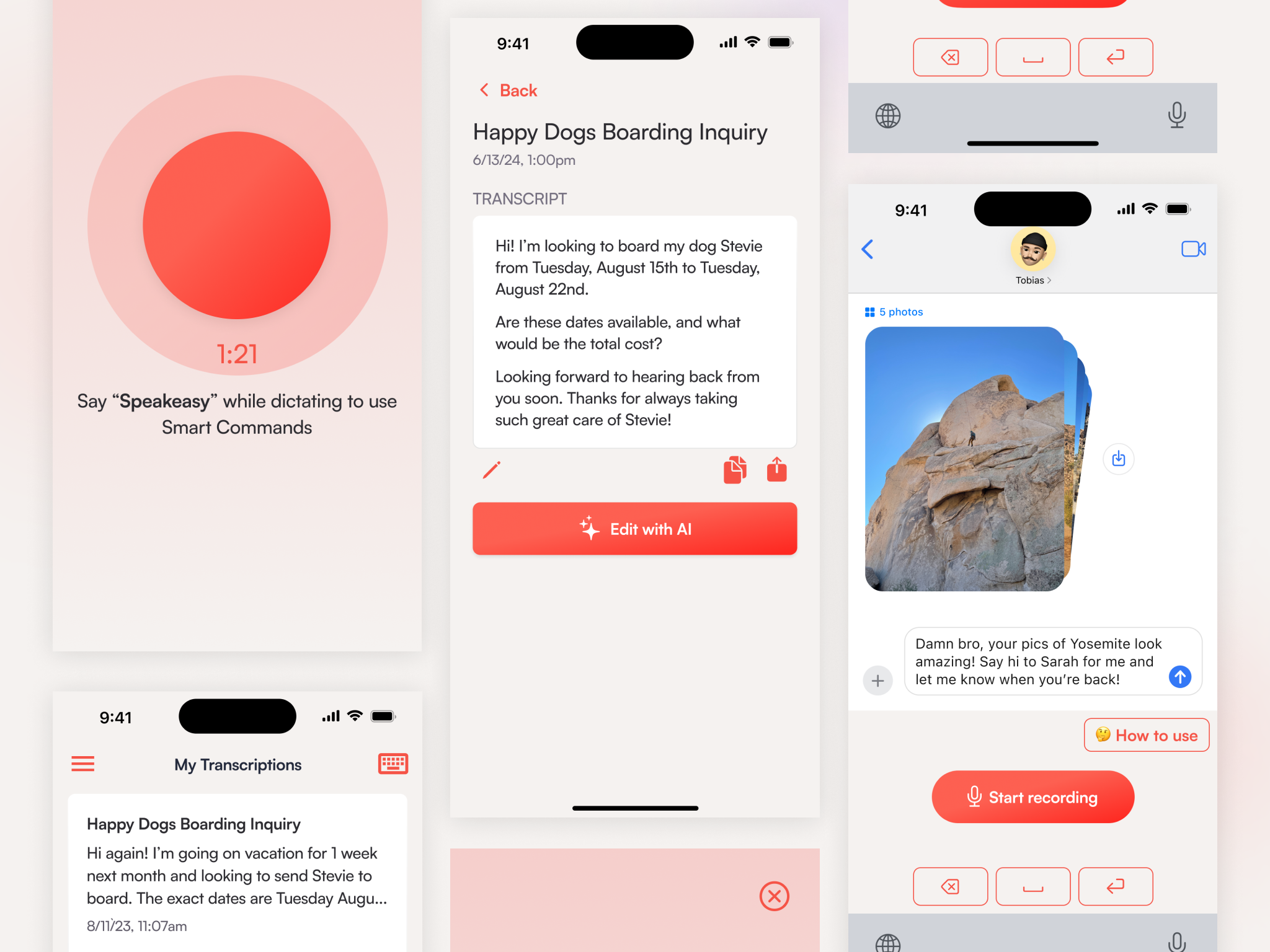
Speakeasy is an AI dictation and writing iOS app. It makes writing on mobile frictionless, with incredibly accurate dictation and AI editing, usable in our app or directly in any other app via custom keyboard.
Summary
- Researched, designed, coded, and shipped an AI dictation and writing app, Speakeasy (link to app store), from zero to App Store as a co-founder on a team of 2
- Drove entire product lifecycle: research, design, development, marketing, and growth
- Learned Swift from scratch (with help from GPT and Claude) to build the iOS app; contributed to the Python transcription, cleanup, and AI editing service
- Created complete visual identity including app UI, logo, website (which I also built), marketing materials
- As of Nov '24, Speakeasy has powered 20,000 transcriptions and 1,000,000 seconds of audio!
Background and Research
My partner and I had the idea for Speakeasy came when we heard about Whisper, OpenAI’s speech-to-text API. While the technology was amazing, OpenAI didn’t productise it, and a quick search on the App Store (in September 2023) showed nobody else had yet either.
We took a scrappy approach to user research to validate the opportunity: conversations, surveys, online searches (especially on Reddit), and quick tests, e.g.
We also saw a niche in the market:
- There were only 3 apps in the App Store doing AI dictation
- They were clearly developer experiments with clunky UX and UI
- None had keyboards so they required users to dictate in the app and then copy/paste to messages, emails, or note-taking apps
So we leapt on the opportunity and decided to build the app—I quit my job at Cedar to work with my partner full-time on it. We’d never built or marketed an app before or coded with Swift, but figured with our engineering backgrounds and GPT-4 and Claude, we could figure it out.
Design
I did all of the UX and UI design for the app, from whiteboarding concepts to the final visual identity.
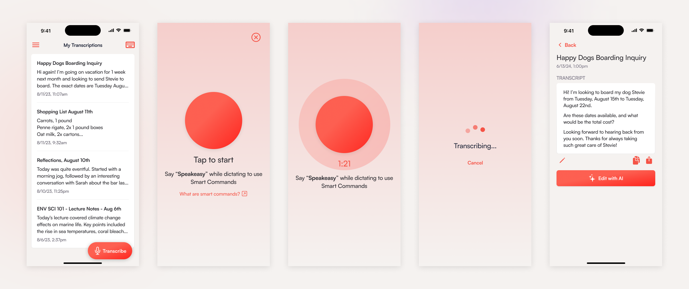
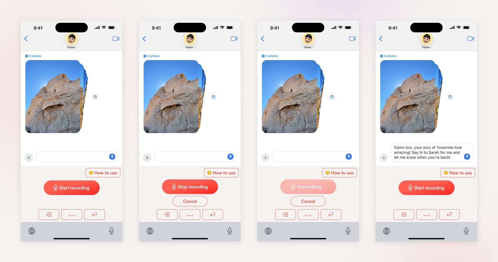
While the app itself sounded simple, I ran into a surprising amount of complexity and novel design challenges:
- Interactivity, asynchronous events, and state transitions
- Permissions (e.g. mic and keyboard access), errors, and retrying
- Designing a keyboard for iOS
- Onboarding and driving users to key activation moments, like setting up and transcribing with the custom keyboard
- Add a free trial, billing, and subscription nudges to the UI
This is just a selection of designs - let me know if you'd like to see more:
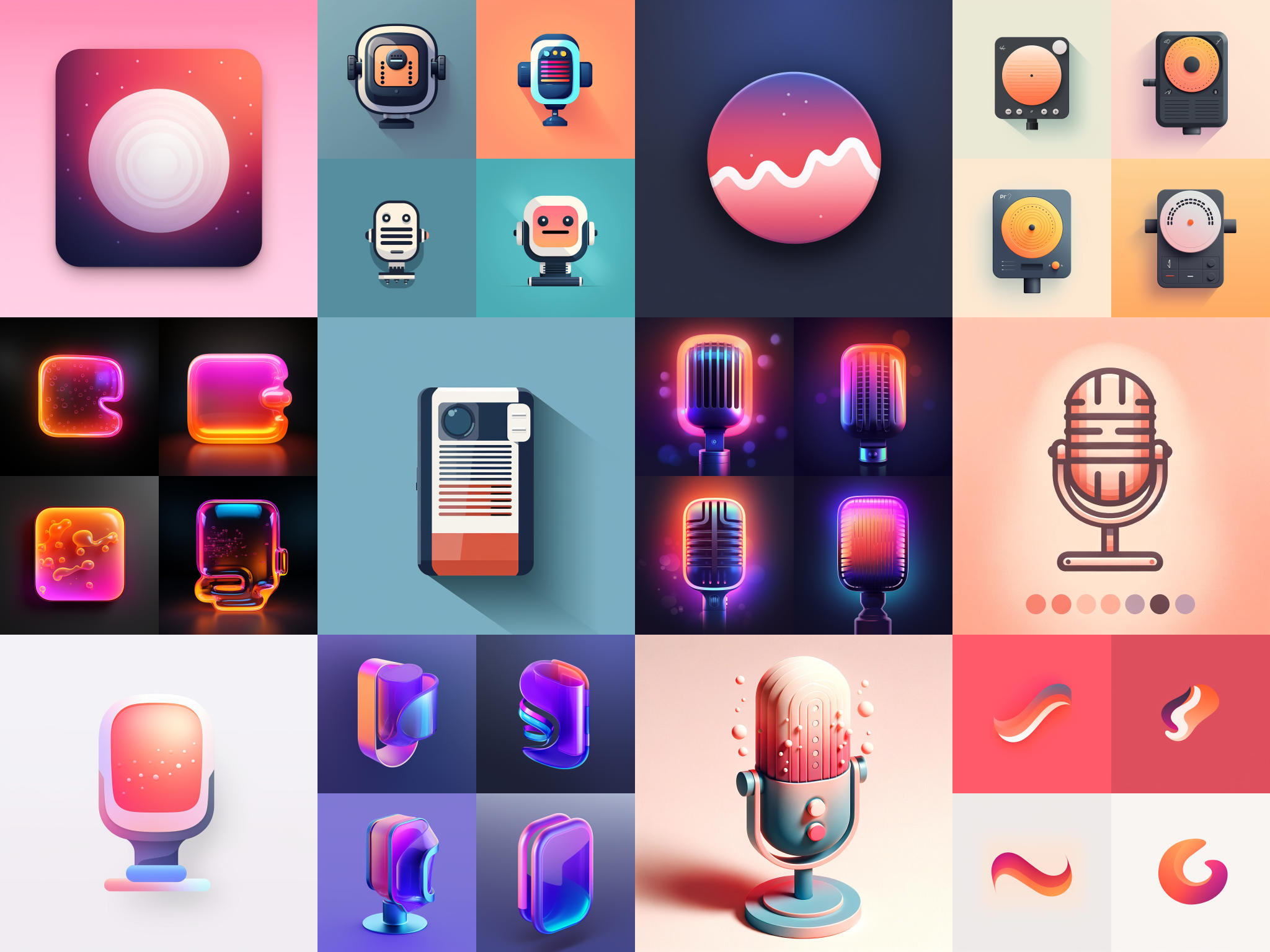
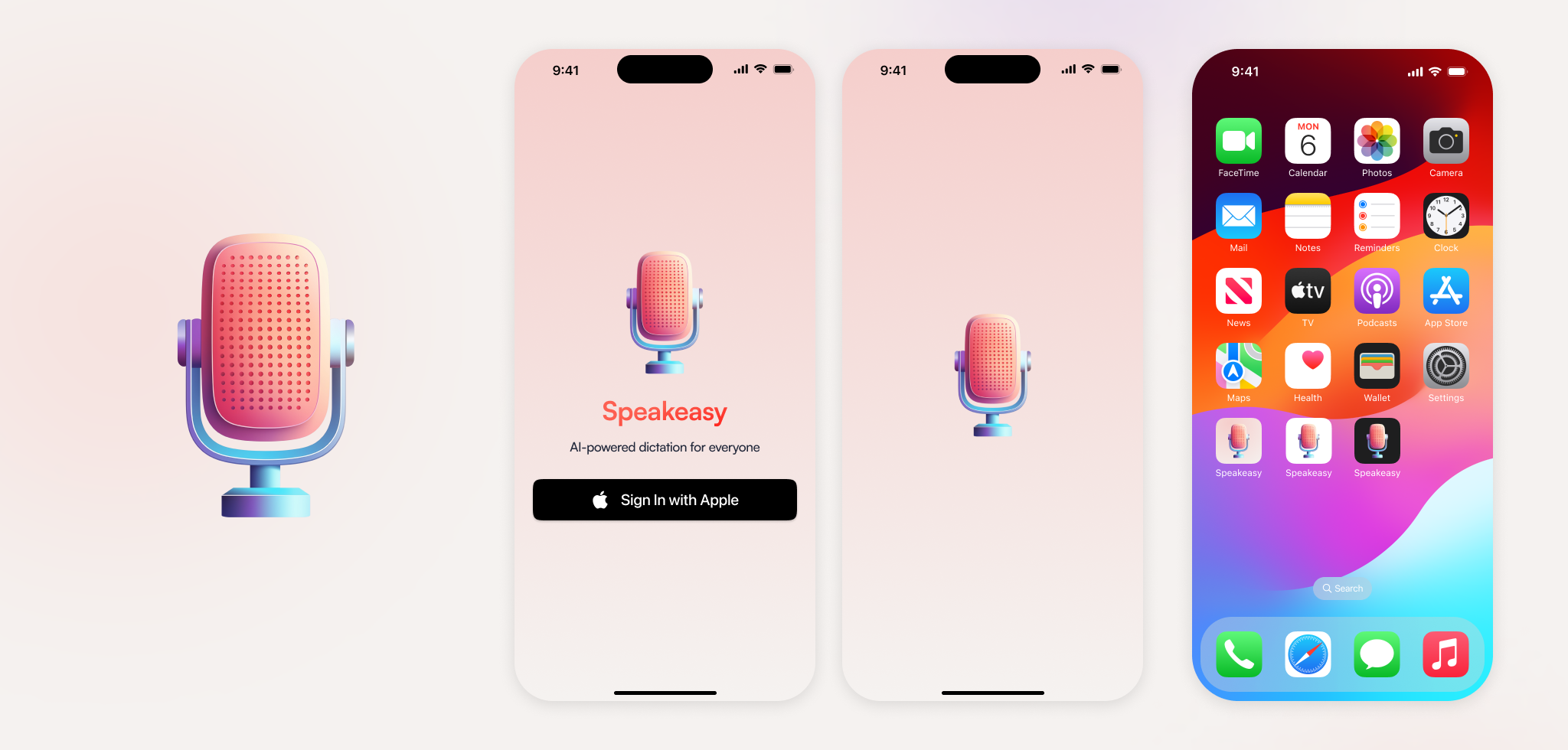
I also designed our logo, which included a lot of competitive research on how to stand out, and experimentation with Midjourney to generate options.
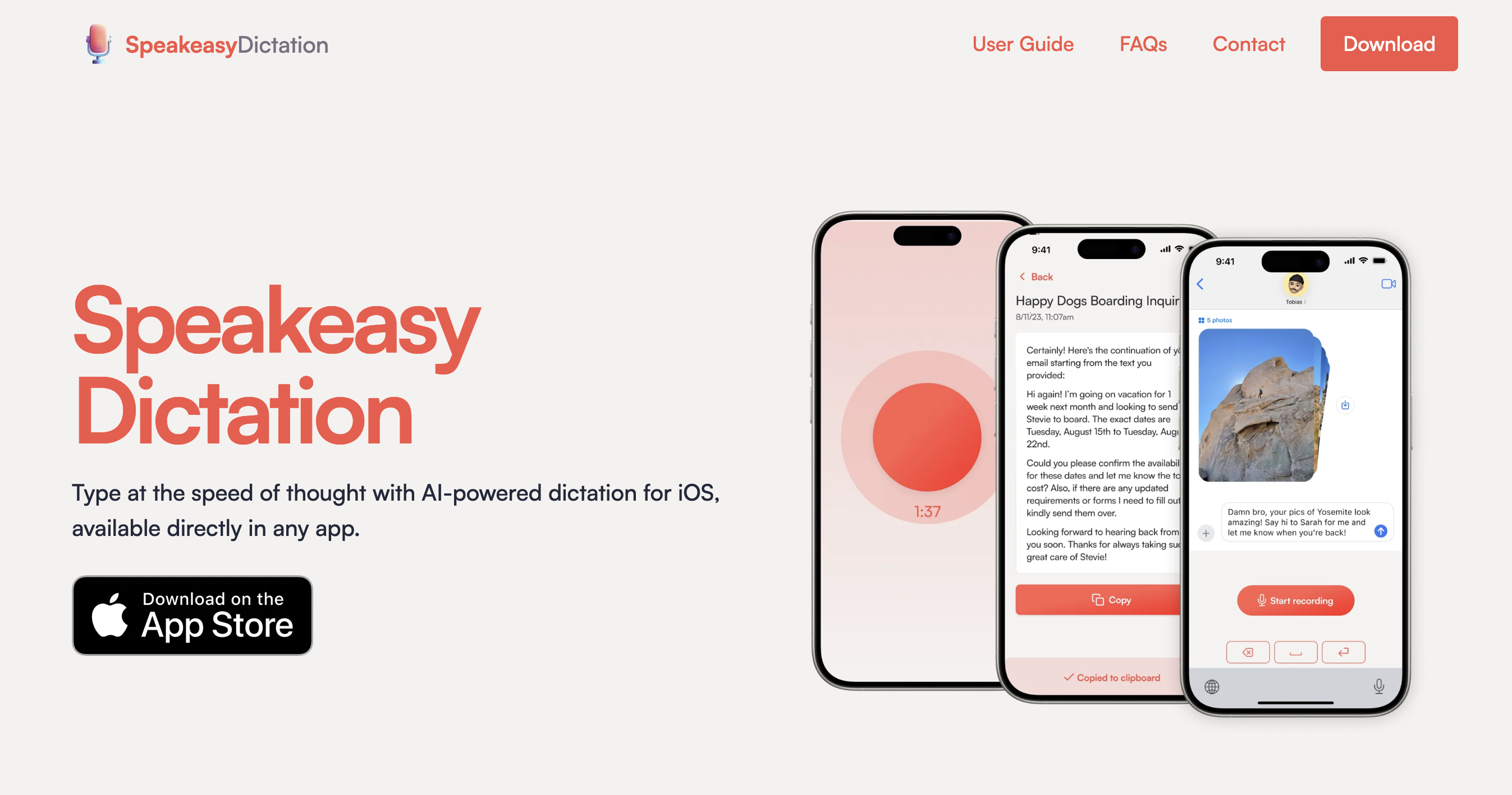
And I also designed and built a responsive marketing website, which you can see live here.
Other Work
In addition to designing the app, I had my hands in every other part of building and launching it, including:
- Learning Swift from scratch to build the iOS app
- Contributing to the transcription, cleanup, and AI editing service in Python
- Navigating the iOS app store review process
- Setting up feedback channels to iterative improve the app—coming up with a metrics plan and implementing Mixpanel, building feedback channels and forms into the app, and setting up a beta testing program.
- Making a marketing plan and executing on it, using paid channels like Apple Search Ad campaigns, and organic ones (e.g. on Reddit, IndieHackers, and HackerNews)