The Farmer's Dog: Mobile Checkout
Nov 2020—Jan 2021
The Farmer's Dog (TFD) is a subscription service providing freshly cooked, healthy dog food to pet parents. I worked there as a full-stack engineer, but after our designer left, jumped in to explore design changes to close a significant gap between mobile and desktop checkout conversion rates, and also implement it.
Role: Product Designer, Software Engineer
Team: 1 Product Manager
Results
- Achieved a 22% improvement in conversion rate for the first phase of changes
- Translated to 2,059 additional checkouts in the first month
- Successfully launched first of four planned improvement phases
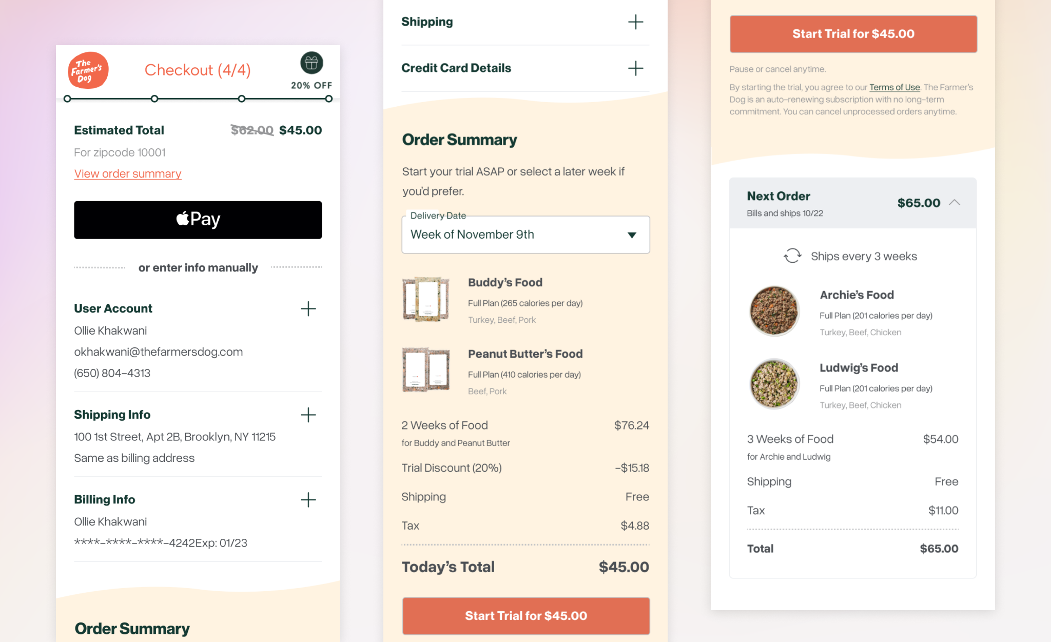
Context
I took on this project as both designer and engineer because I was the engineer on TFD's Acquisition pod (responsible for the signup experience), and we had just lost our only designer.
In mid-November, I was tasked with addressing a critical problem before Christmas (high season for sales): our mobile checkout wasn't performing. 78% of our visitors were on mobile, but converted at only half the rate of desktop users.
That gave me 4 weeks to research, design, and code the first phase of improvements, so I needed to move quickly but thoughtfully.
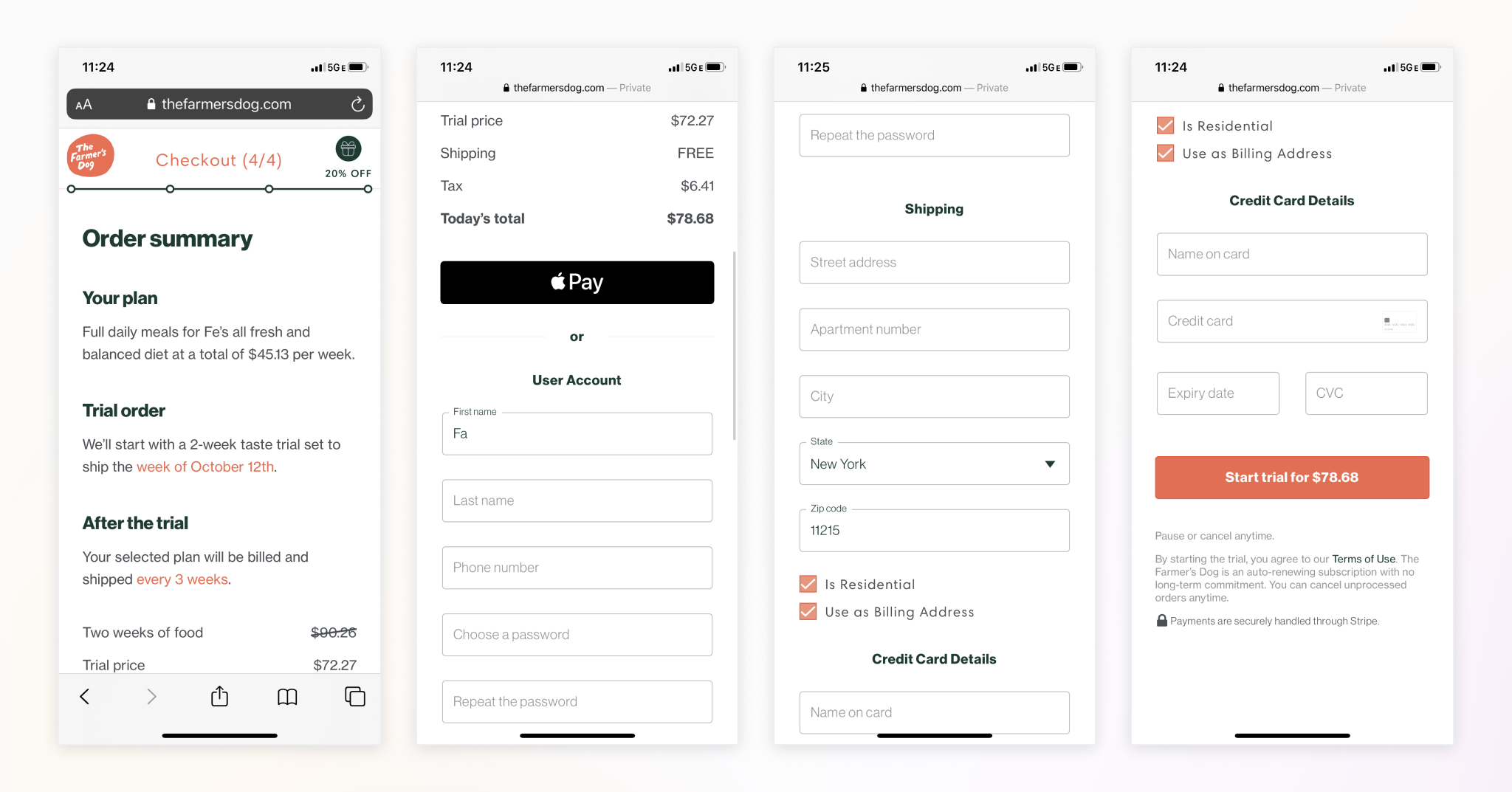
User Research
Methodology
I rapidly gathered insights through:
- Customer support conversation analysis
- Competitive research (Harry's, Casper, Misfits)
- Existing user behavior data
- Usability tests with 8 users via PlaybookUX
Key Findings
Information Clarity
- Users struggled to understand subscription costs and future orders - the info was presented as full sentences, and a strange set of numbers was chosen
- Mobile users feared missing information available on desktop
Form Usability
- Content wasn't logically ordered: the pricing info was separated from the checkout button, forcing users to scroll up and down
- Aggressive validation and modal errors disrupted checkout flow
- Password creation added unnecessary friction
Design Solution Implications
- Progressive Disclosure: Break the form into logical sections using an accordion pattern
- Subscription Transparency: Make recurring costs and future order details clearer
- Simplified Authentication: Remove password creation from checkout
- Smart Validation: Implement inline validation to catch errors early
Design Solution
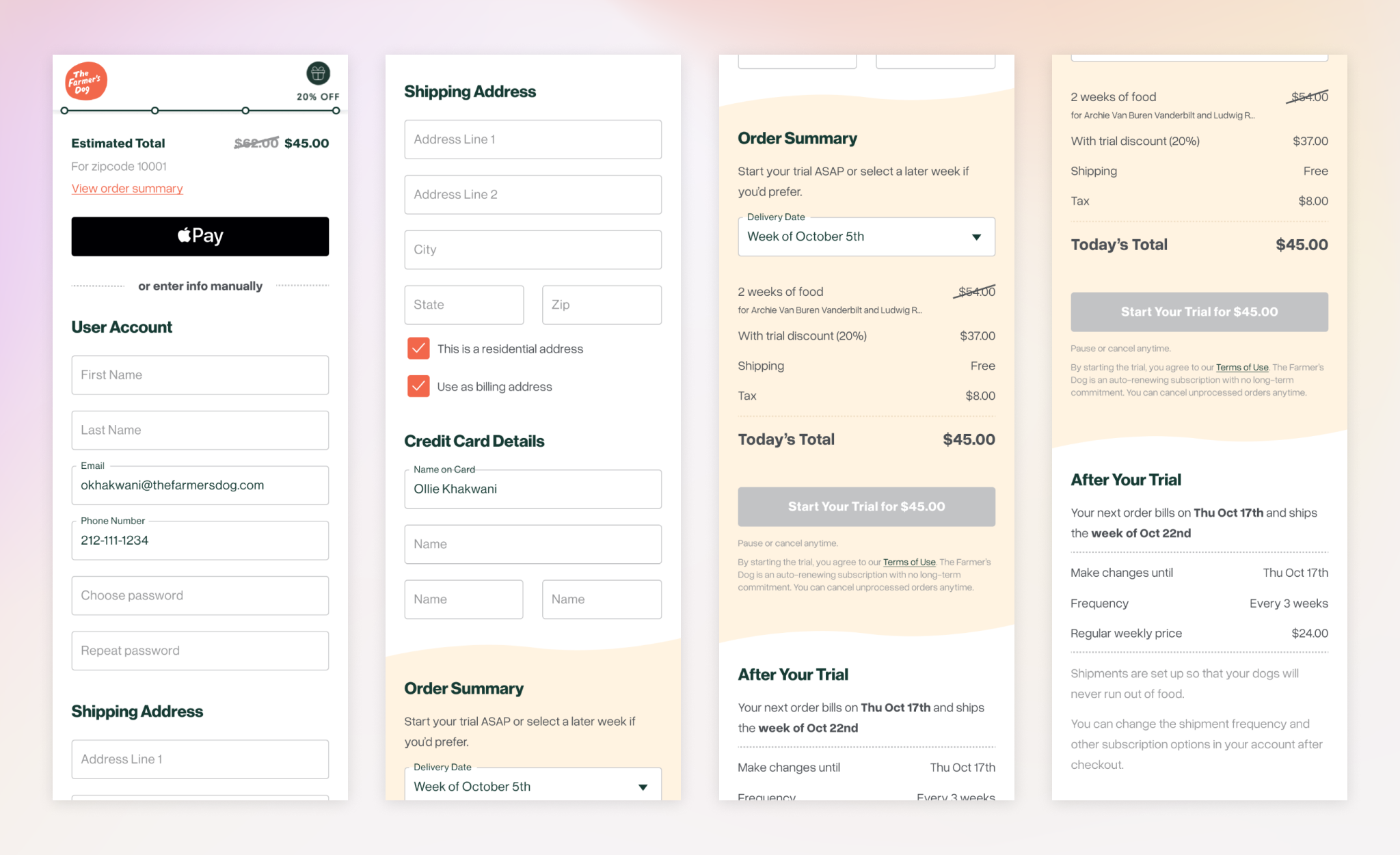
Given the tight timeline, I broke the improvements into phases so that I could implement and A/B test the quick wins we were more confident in before Christmas while continuing to research more complex solutions.
Phase 1: Subscription Info Redesign (Shipped)
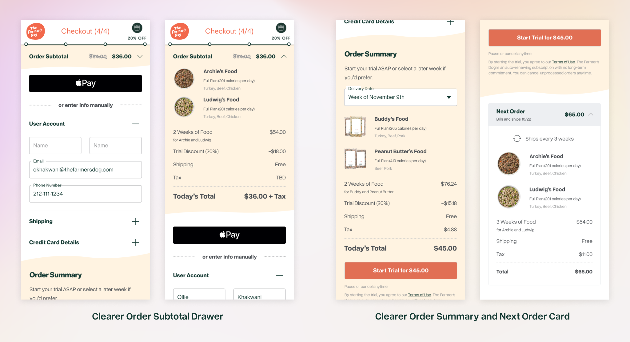
- Reordered content to group trial order and CTA
- Put basic order info in fixed header so always visible
- Clarified presentation of next order/subscription info: sentences → table
- Launched within 1 week of development
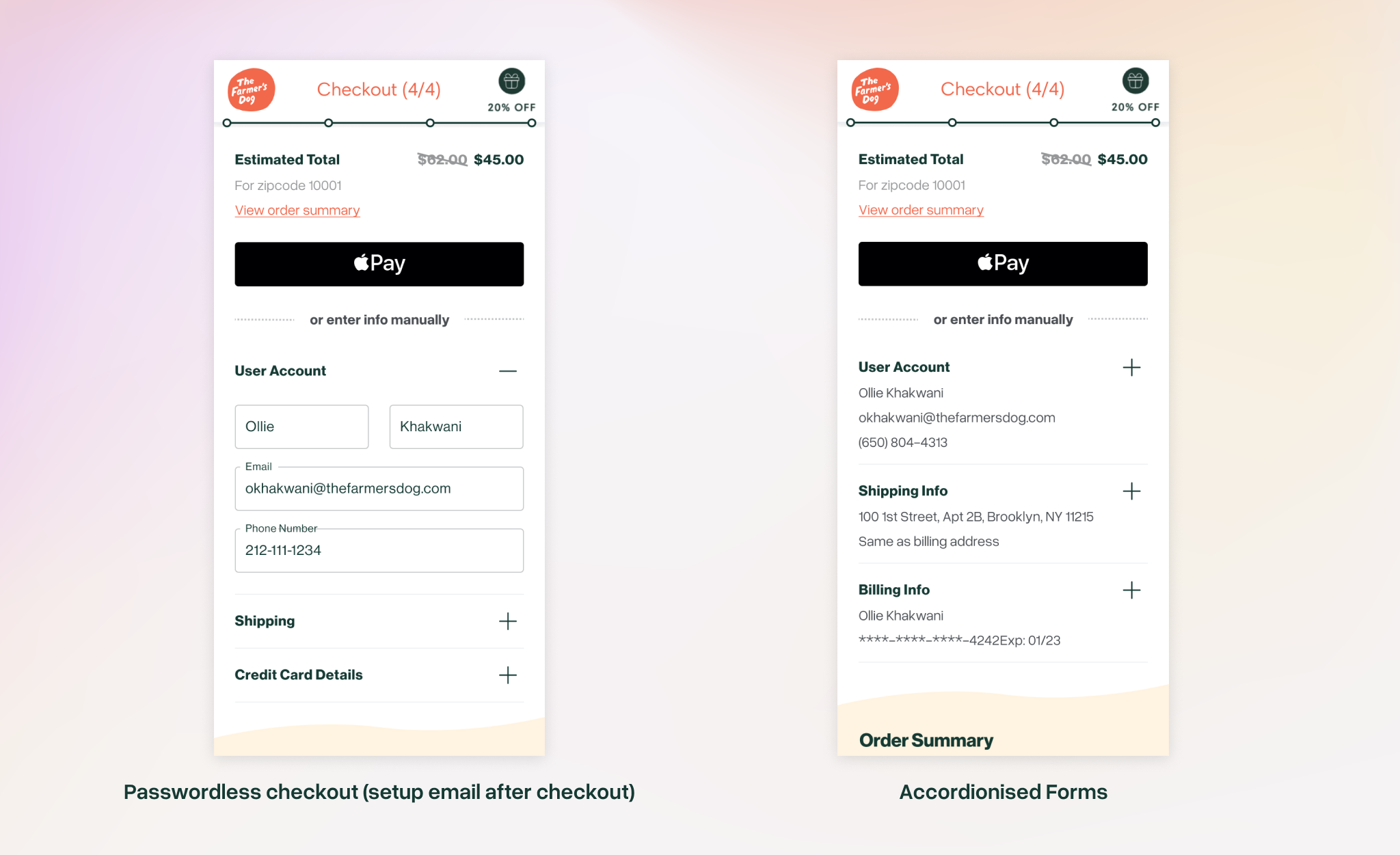
Phase 2: Passwordless Checkout (Ready for A/B Testing)
- Removed password creation from checkout flow to streamline (would have been in Phase 1 but had backend dependencies and wouldn't be done by Christmas)
- Added automated post-purchase password setup email
Phase 3: Accordion Form (Design Complete)
- Broke form into logical sections
- Reduced overwhelming appearance of long form
- Added clear progress indicators
- Design approved, pending usability testing
Phase 4: Enhanced Order Summary (In Research)
- Created detailed next order cards
- Added visual elements like recipe images
- Further improvements to subscription clarity
- Validated design through user research
Results
Phase 1 Impact
- 22% improvement in conversion rate on mobile (10.80% to 13.11%)
- Resulted in 2,059 additional checkouts in first month
- Reached statistical significance within 4 days
Next Steps
I left The Farmer's Dog in early 2021 - at that point Phase 2 implementation for (passwordless checkout) was done and about to be released. The remaining work was handed off to other people:
- Rollout passwordless checkout A/B test across mobile and desktop
- Complete usability testing for accordion form design
- Continue research on price presentation (full vs. weekly pricing)